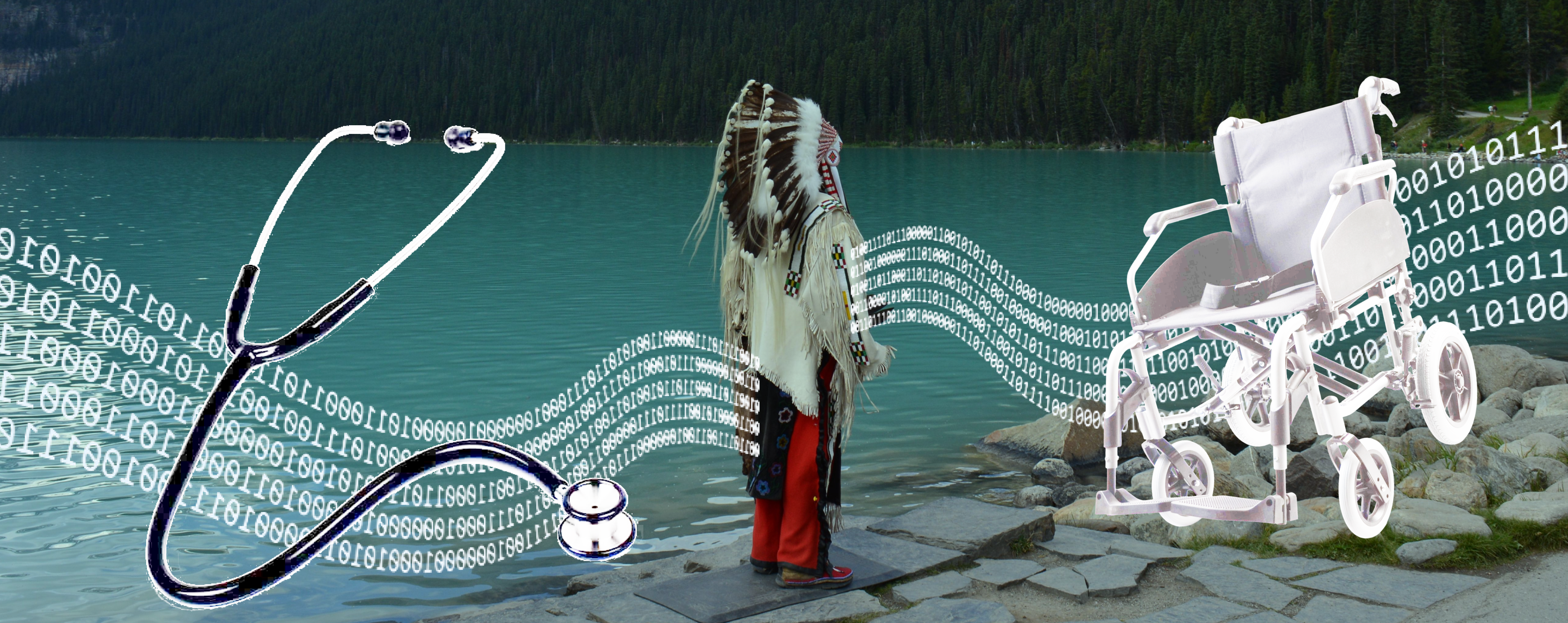
Racism in healthcare — and no data to fight it
In late 2020, a commissioned investigation reported on stories of rampant racism towards Indigenous peoples in British Columbia's healthcare system.
At Fraser Health, leaders in Cultural Safety set out to create systemic change — but they quickly realized that they lacked evidence that could detail the disparities in treatment between Indigenous and non-Indigenous patients. Without data, there was no way to know where things were going wrong, or to measure whether interventions were working.
The business goal
The organization's goal was to decrease instances of discrimination against Indigenous patients. Yet leadership could only accomplish this if they knew where things were going wrong. To surface the true story of Indigenous experiences in our hospitals, our design team asked:
How might we dispel stereotypes about Indigenous patients and pinpoint when they may be receiving different standards of care compared to non-Indigenous individuals?
The solution we created
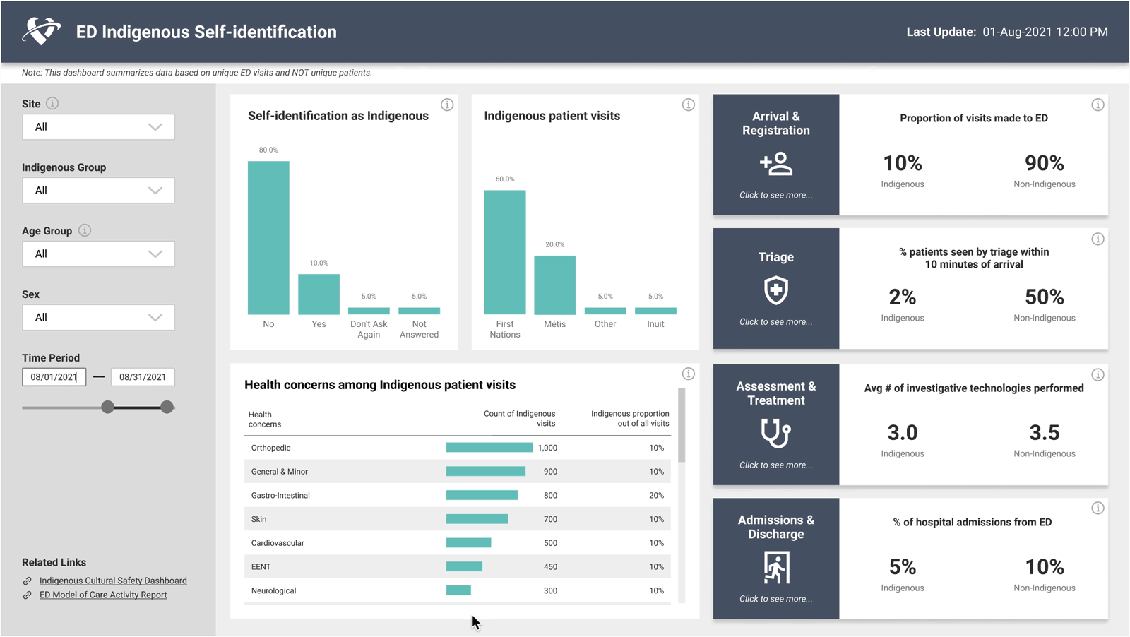
The Emergency Department Indigenous Cultural Safety Dashboard (ED ICS) reflects key transition points in clinical patient flow through emergency care — connecting data with the human side of the patient journey.
At each stage, key metrics are compared and contrasted to identify gaps in Indigenous patient experiences. As of March 2022, only the first stage of the product had been completed. This case study focuses on what was shipped in December 2021: the dashboard's Summary Page.
How we found the right solution
Spotting disparities was our users' top concern
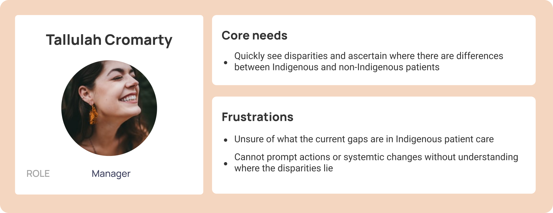
The Cultural Safety Team was both our client and the main target user. These individuals best ingested data insights through first observing the big picture before drilling down into details.
It quickly became clear that they were most compelled by seeing comparisons — side-by-side data that could make inequities undeniable.

Centering stereotype-busting as the product goal
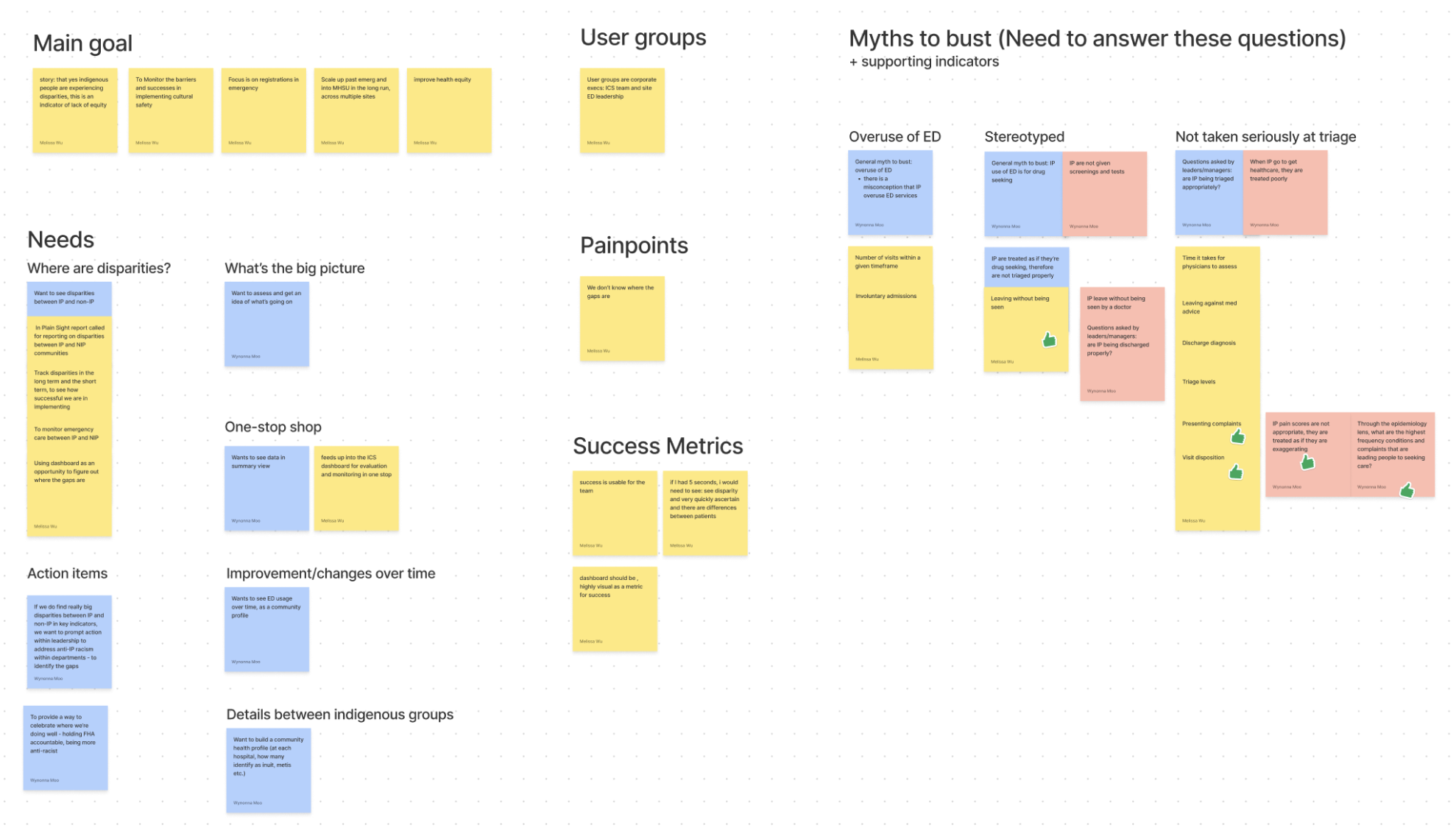
We ran user interviews to extract client assumptions, frustrations, and hopes for the product. Qualitative context was crucial to understanding the sensitive nuances in this problem space.
Identifying patterns with affinity mapping summarized interview insights and centered our product goal around providing answers to three key statements:
- It's a misconception that Indigenous peoples overuse the ED
- Indigenous peoples are often treated as drug seeking
- Indigenous peoples are not given proper screenings or tests, wait longer for assessments, and often leave without being seen by a doctor
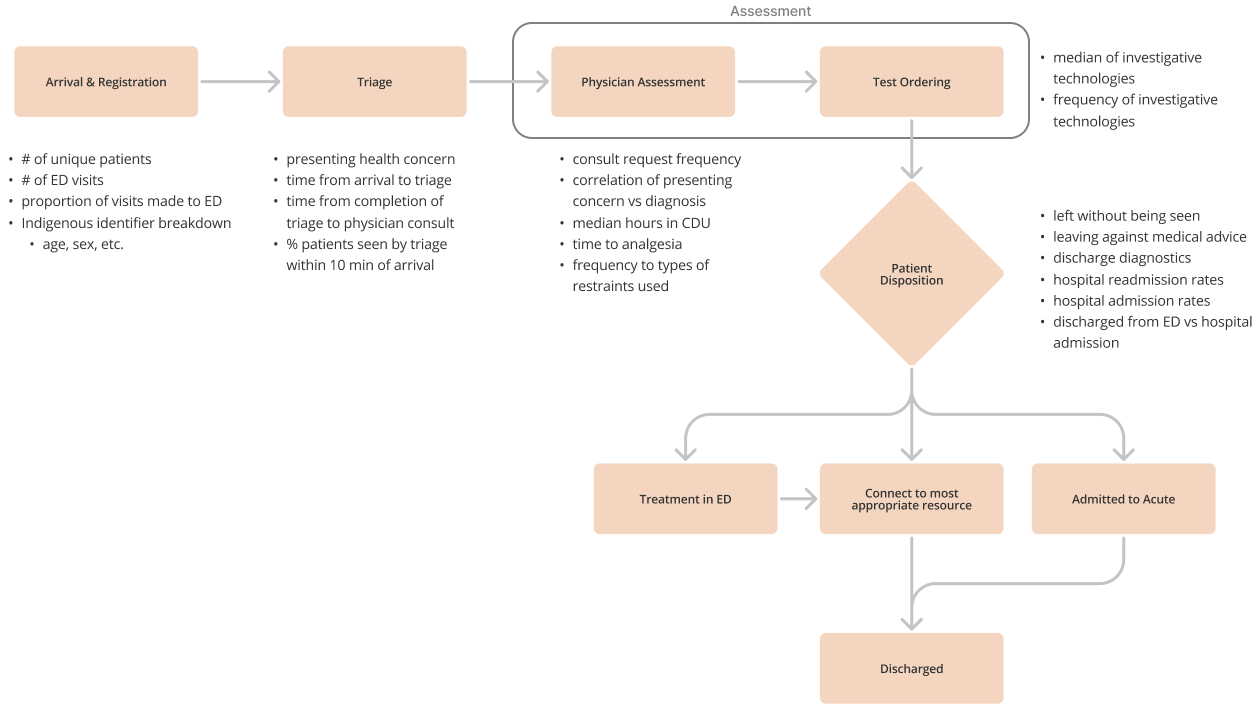
Design had to map to patient flow
Data by itself is not an intuitive experience. In order to relate numbers to what was actually happening in the ED, we staggered visualizations to follow the steps a patient physically takes through emergency care.
As each physical touchpoint was dependent on its precedent, our digital metrics had to reflect those same dependencies. We worked closely with the development team to map clinical paths and tied relevant metrics to each step based on user needs and technical feasibility. Where multiple metrics were possible, the ones that supported stereotype-busting were prioritized.
Co-designing with clients kept everyone aligned
Our team used low-fidelity wireframes to quickly scope big ideas and rapidly adjusted sketches through multiple workshops with users and developers.
This style of working in the early stages helped everyone stay on the same page, know what to expect, and learn from subject matter experts. Best of all, open communication meant we avoided major changes in subsequent hi-fi and development phases.
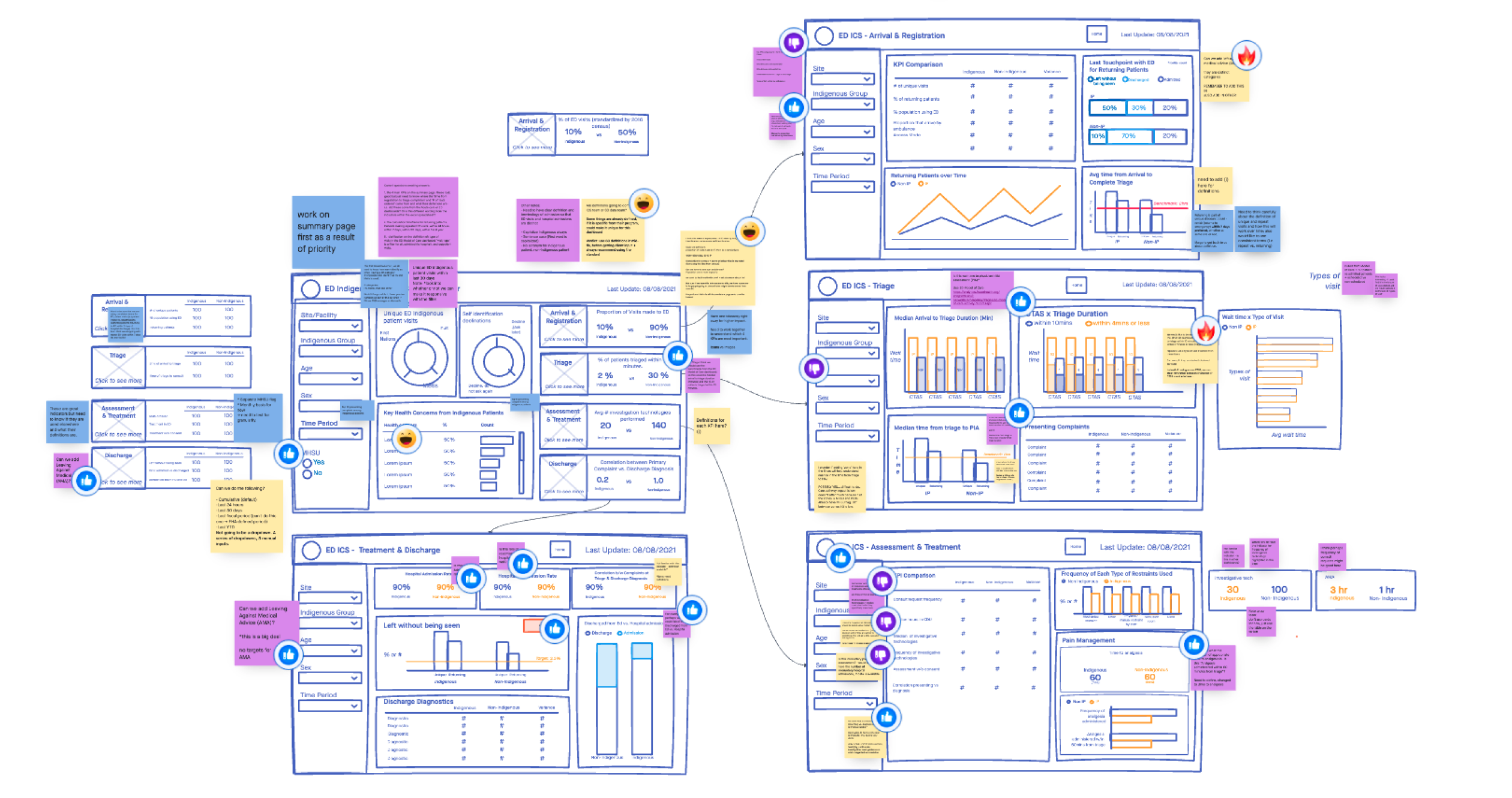
A dashboard designed for how users actually think
Observations from our interviews indicated that users operated best by first understanding big-picture conclusions before analyzing relevant details. The Summary Page was built to accommodate this.
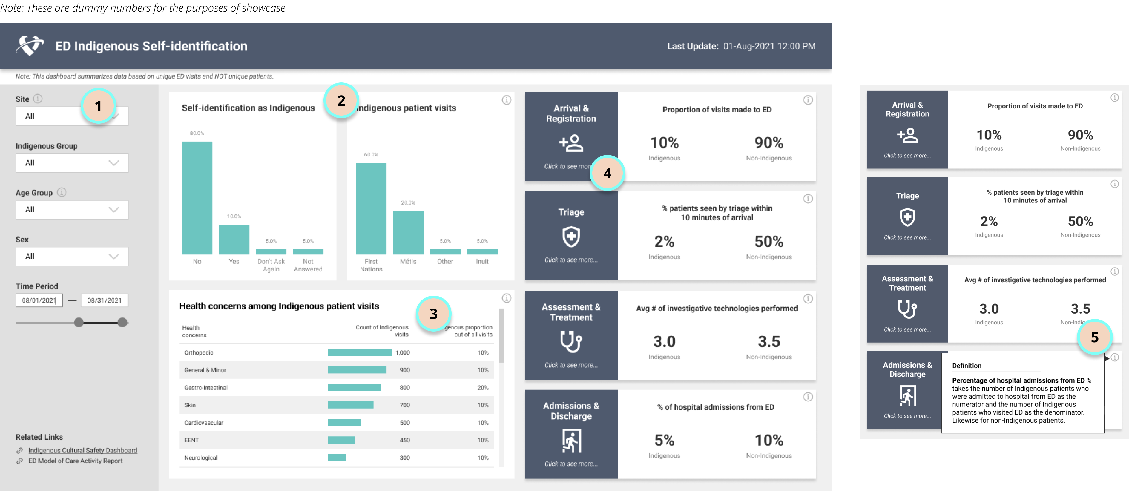
- Granular group filters — users can drill into disparities of particular Indigenous groups to identify the scope and severity of potential gaps
- Visit breakdown — directly busts the stereotype that Indigenous individuals overuse the ED
- Health concern categories — surfaces the proportion of patients flagged as drug-seeking, a key concern identified during research
- Stage-by-stage alert metrics — clicking the blue squares navigates to stage-specific detail pages for deeper investigation at each point in the patient journey
- Information hovers on every metric — explains how evidence is sourced and calculated, giving credibility to the data surfaced and the conversations it can start
Impact and what comes next
First Indigenous Cultural Safety dashboard of its kind in British Columbia.
Cultural Safety executive director was moved to tears at the launch — she had been waiting years for this.
Pioneered a model for surfacing Indigenous patient stories to drive systemic change in hospitals.
Made history in BC healthcare — the ED ICS dashboard is the first of its kind in the province, a pioneer in surfacing the stories of Indigenous peoples in our hospitals.
Quantitatively, we're still in the process of measuring impact through user surveys. In the long-term, we will be measuring product effectiveness by scrutinizing changes in disparities based on interventions implemented.

What comes next
The Summary Page by itself is not enough to provide the entire "why" behind metric performance. Starting from "Arrival and Registration," we will gradually work our way through all 4 ED stages — giving the Cultural Safety Team the full picture they need to act on what they're seeing.
What I learned
No matter how well-vetted our visualization designs were, our team still faced instances where developers had to retract their initial approvals once they dug into the data tables. New inflexibilities surfaced constantly — and I became comfortable with knowing things could change at any minute.
More than anything, I'm grateful for this journey. It humanized and taught me more intimately about the struggles and hopes of Indigenous peoples in BC. It's my sincere wish that this product contributes to a safer healthcare space for them.