The big problem
I was a product designer at Procurify — a spend management platform built on giving companies full visibility over how money moved through their businesses.
By mid-2024, that promise was cracking. Two problems had surfaced, and they were compounding each other.
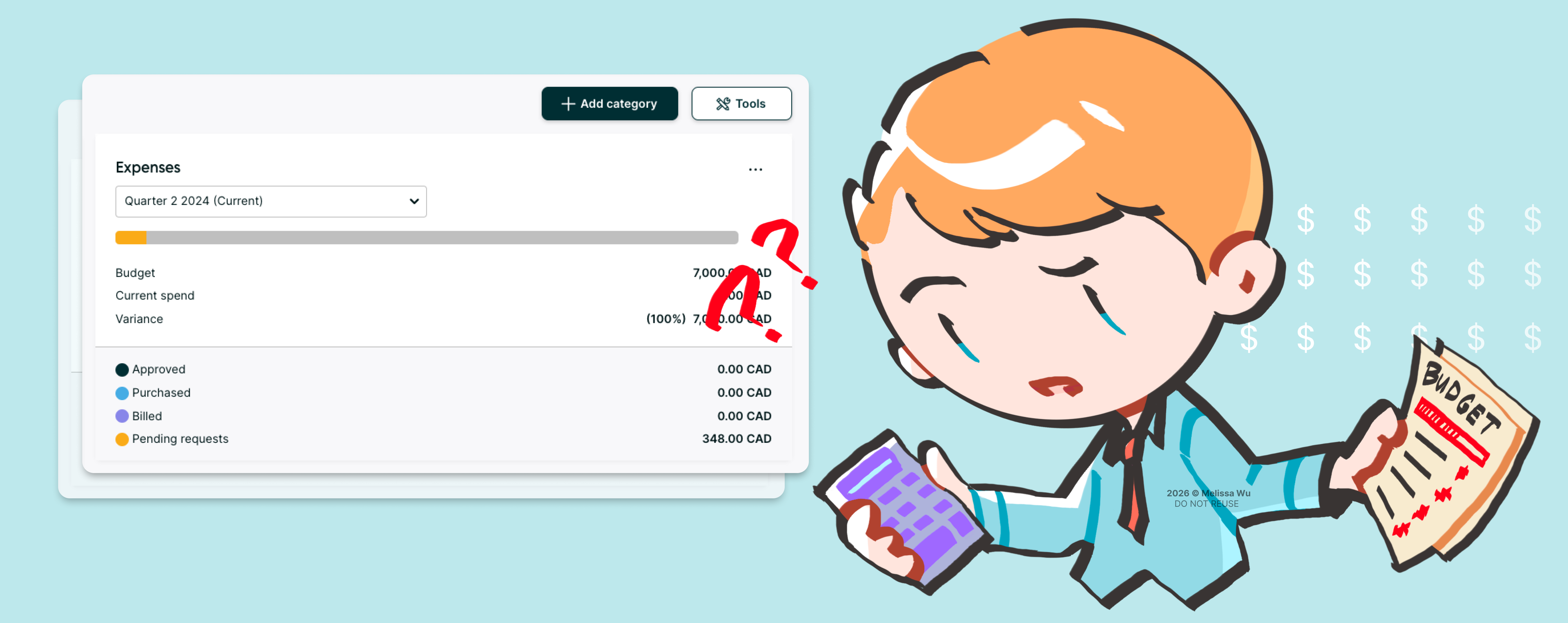
A top-10 client was on the verge of churning. Clients couldn't determine how much money they owed vendors — because Procurify's budget interface didn't distinguish between "purchased" and "received" goods. To get that number, they had to manually comb through every purchase order themselves.
Users were reaching for physical calculators to verify the budget UI numbers. Confusing layouts and misleading terminology had convinced them they couldn't trust the product — and the longer it persisted, the deeper the credibility damage went.
What changed because of this work
Top-10 annual revenue client retained on the platform.
Unified design language across 4 product areas.
Built the UX foundation that future features can actually build on — clearing the path to 60% feature adoption.
What I did
Turn Procurify's data into certainty. Make financial risk visible at a glance — so users could finally trust what they were looking at.

Strategic discovery & audit
Surfaced years of high-value usability debt hiding across core workflows.
- Competitive benchmarking + workflow mapping
- 2+ years of qualitative & quantitative customer feedback synthesis
- Full interface and workflow audit
Cross-functional prioritization
Negotiated to keep quality-of-life fixes in scope — not just the functional ones.
- Aligned Product and Engineering on MVP, roadmap, and fast-follows
- Kept engineering constraints central to design decisions — so the work was always a team effort, never design in isolation
Data-backed advocacy
Secured stakeholder buy-in by keeping every design decision anchored in user data.
- Multiple stakeholder design reviews from concept through sign-off
- Validated designs with 11 UserTesting participants — using volume of user evidence, not opinion, to drive stakeholder alignment
Platform cohesion
Kept the design system intact across every surface, web to mobile.
- Synced release cycles with the mobile team for simultaneous launch
- Followed established design library processes — and contributed new components back into it
More than what meets the eye
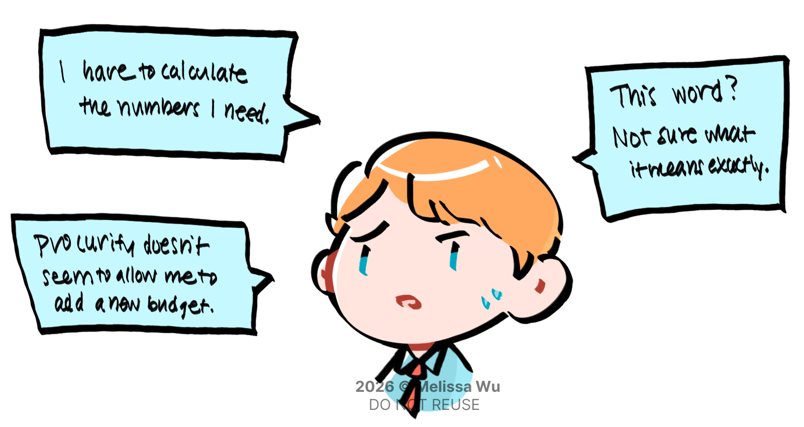
Adding a new "receive" label would have saved 10k in revenue. So why not just ship it?
Because it wasn't clear if that was the right solution, or just the easy one. Could we push this release further and clear some design debt while we were at it? To find out, I ran a multi-source audit to map out the budget landscape: Pendo polls, 2+ years of Productboard and Gong call synthesis, client interviews, and a competitive sweep.
What came back made one thing clear: adding a label would be a bandaid fix on a broken system, because budgets couldn't even provide the bare minimum.
- 53%of poll respondents reported difficulty understanding their remaining budget
- 42%said they found the budget tracking UI hard to use
- Benchmarking surfaced that Procurify was the only spend platform not using industry-standard budget terminology
- Interviews revealed that users were confused by the numbers and layout — and often believed features were missing when they were simply mislabelled
Getting the triad aligned
As design, I knew we needed to bake interface fixes into this release — giving users the basics they expected from a budgeting tool. But, how do you convince your triad it's worth the undertaking?
Product was an easy sell: these fixes directly supported our 60% adoption target. Engineering was a harder conversation.

The engineering manager's concern was rooted in existing eng debt and an already heavy roadmap. But because frontend was already slated for a legacy-to-React migration in the future, we reframed the interface lift as "shifting the roadmap".
Doing the UX and frontend work together now wasn't extra scope — it was the smarter use of the work that was going to happen anyway. Piecemeal iterations would only introduce more complexity and cost more in the long run. If we fixed both now, we'd speed up every release after it.
That reframe landed. The triad aligned.
Four moves that made the interface trustworthy
Before anything shipped, I validated with 11 UserTesting participants across a range of budget familiarity levels, ran the terminology by our internal finance team for accuracy, and walked through multiple stakeholder reviews to get sign-off. Here's what shaped the final decisions.
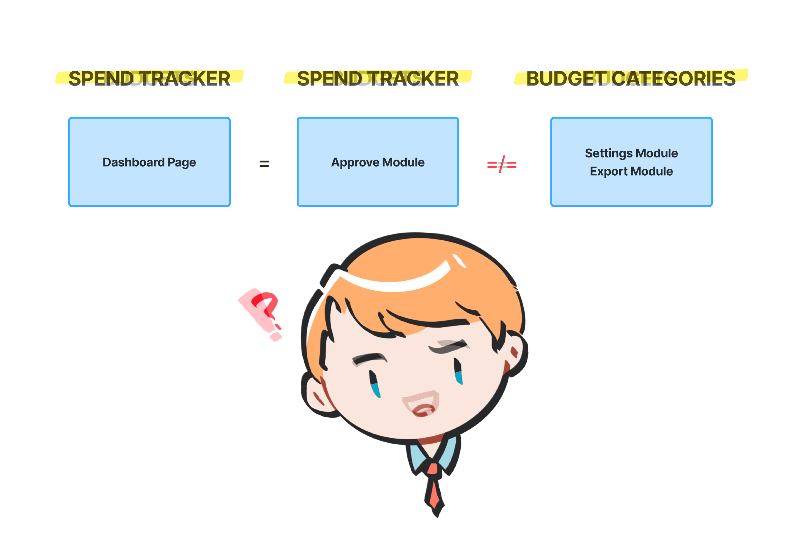
Standardize terminology and UI
Eliminated internal jargon like "Spend Tracker" and "Budget Categories," unifying the ecosystem under the industry-standard term: Budgets. Ensured the Settings and Approval views use the same layout and labels, so users aren't reorienting themselves when switching between the two.
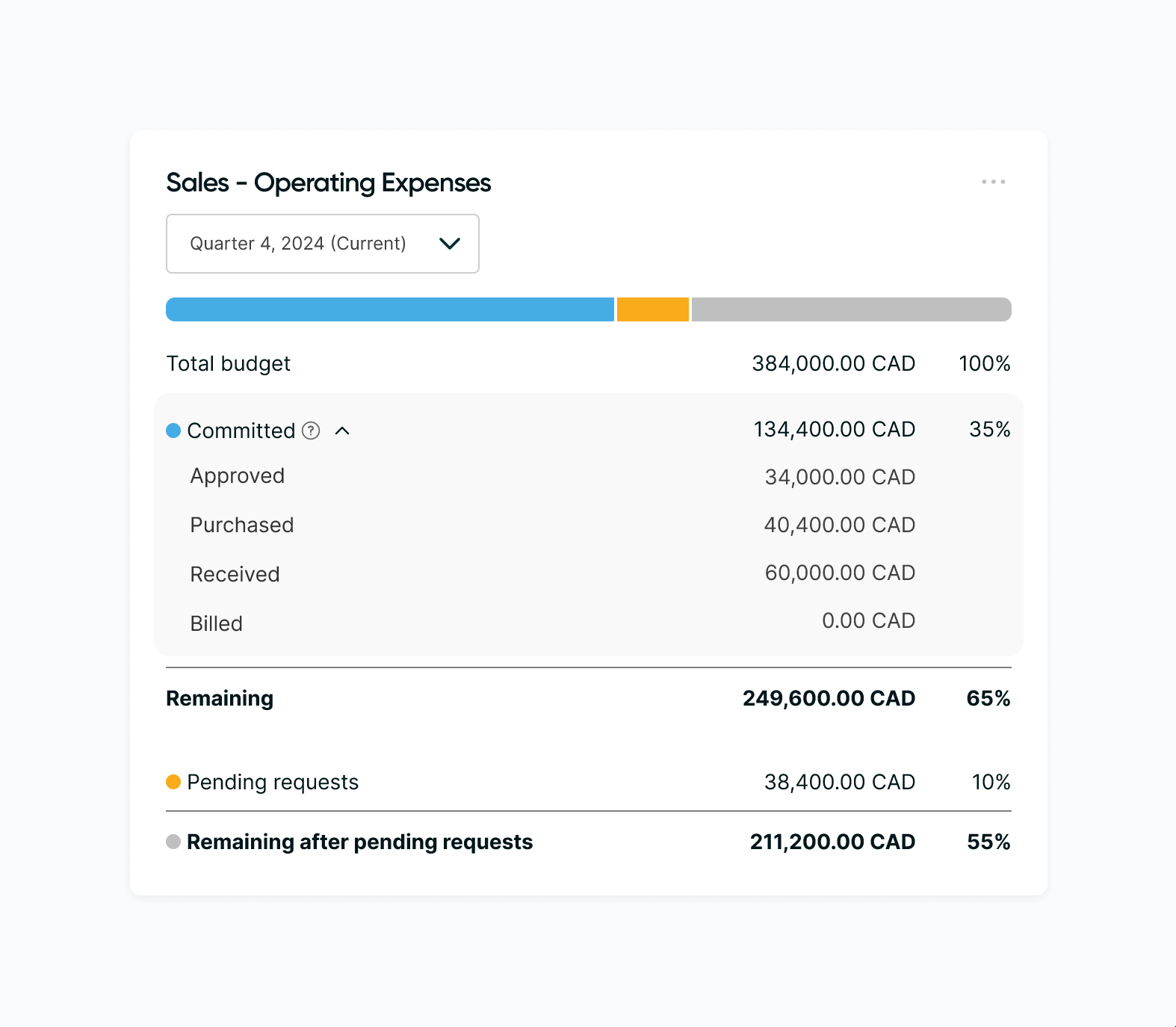
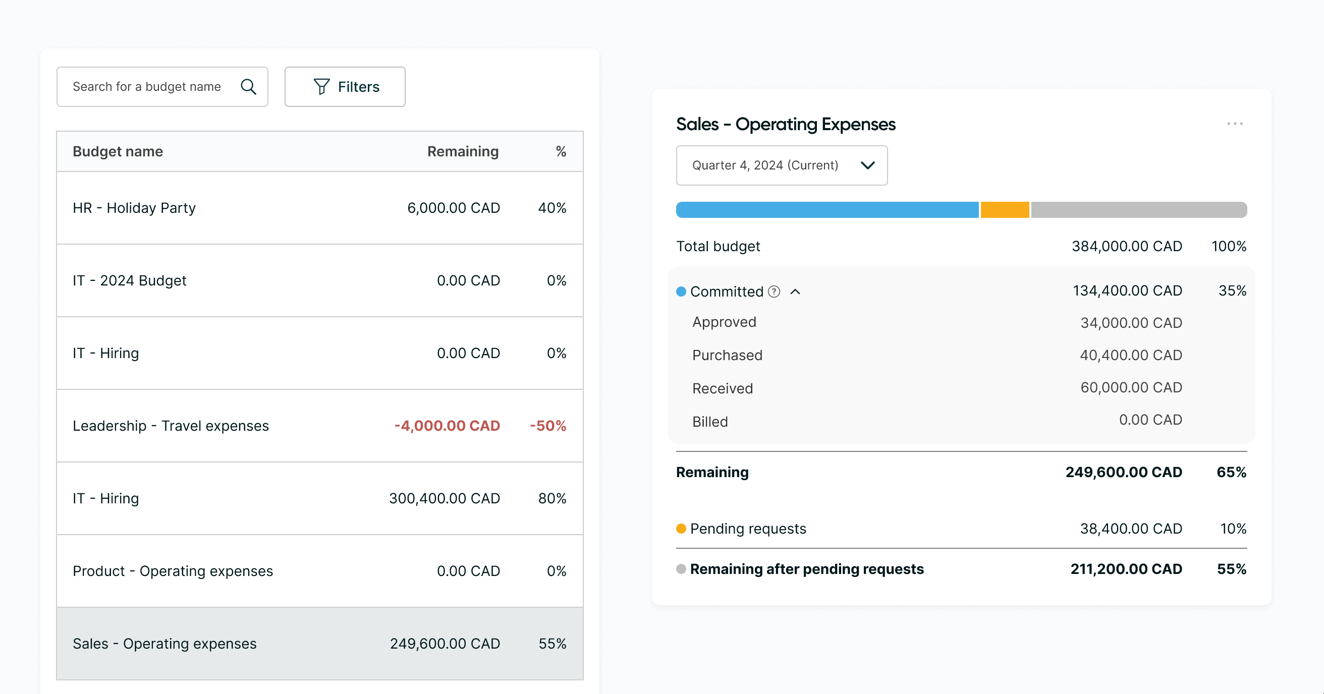
Numbers you need at a glance
Introduced "Committed" as the umbrella term for all spend in motion, surfacing three top-level figures: Remaining, Committed, and Pending. The granular breakdown (Approved, Purchased, Received) sits in an accordion below — open by default after usability testing revealed that hiding it caused users to miss critical debt information. Percentages were also pulled into a separate column to improve scannability.
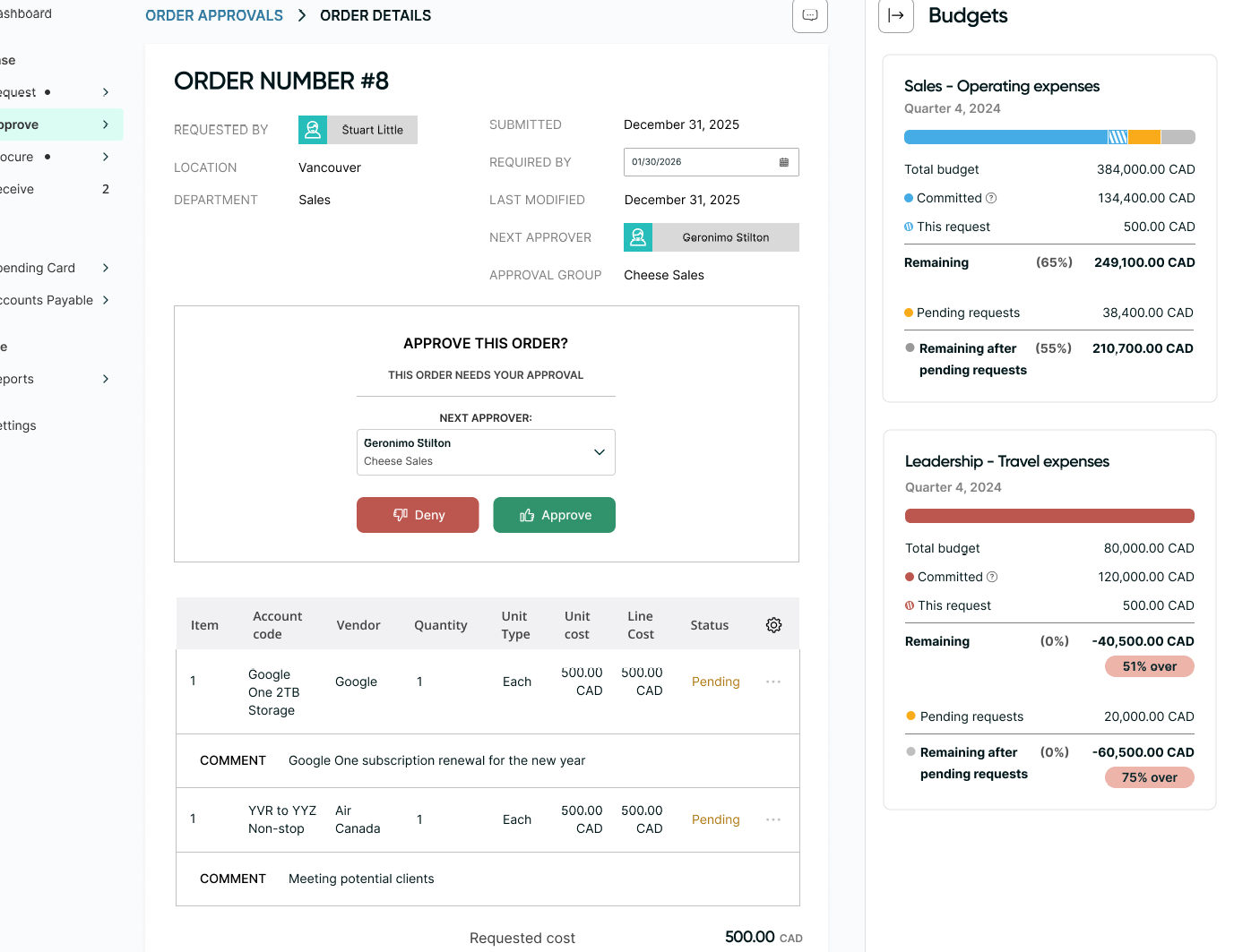
Removing the need for a calculator
Replaced the flat list with a vertical equation layout, making it explicit how each figure flows into the next. Added a clear visual separation between budget remaining with and without pending requests — a planning view clients had been asking for for years.
Explicit overage management
Introduced a dedicated Overage Pill and rebuilt the progress bar from scratch. The audit uncovered that the original bar wasn't a true progress bar at all — it was built as a parts-of-a-whole chart, which is why overage states were impossible to visually parse. The rebuilt bar turns red at 100%+ utilization, and pending requests are removed from the bar once a budget is exceeded to focus attention on actual financial risk.
What it achieved and what I'd do next
Retained the top-10 revenue client by delivering "received" visibility — and extended that fix to every other client running into the same wall.
But the immediate win wasn't the only thing that came out of it. This project set the budgets product up for something bigger:
- Completed the legacy-to-React migration for all budget surfaces, clearing years of accumulated technical debt
- Rebuilt the foundation for user trust through a logical layout and UI components users can actually read
- Reduced future onboarding and support burden by standardizing terminology and adding self-explanatory information hovers
What I Would Do Next
A company pivot meant I didn't get to see the post-launch numbers. But if I had the chance to continue, here's what I'd go after:
- Close the feedback loop — run a second round of in-app polls and client interviews to measure whether the trust gap had actually closed in practice
- Disclose the why — implement drill-downs so clients can click into any category and see every associated PO item, giving them the full picture behind the numbers
- Track adoption — monitor progress toward the 60% adoption KPI now that the budget infrastructure has been rebuilt
That's the end, appreciate you sticking 'til the end!